I have a degree in Interior Architecture and Design. That is what I went to college for. I wish I were a professional designer, but I’m not. To get a license as an interior designer you have to pass a really hard test with multiple parts AND you have to have several years of experience working under the direction of another licensed designer. So, if you meet an actual licensed designer you should know that they have done A LOT to get to that point.
I had my first baby when I was 17. After I graduated from college I took about a year to just be a mom. I was super lucky to have parents who were willing to support us financially. After that, I got a part-time job with a large architecture and interior design firm as a design assistant. I worked while my son was at school. It was fun and I learned a lot about the industry. A little while after I got engaged I stopped working and went back to being a full time mom again, thanks to my sweet husband supporting me financially.
Since that time the extent of my design work has been for myself and some of my family. I sometimes dream of being a “real” designer. But I know that I am supposed to be a full-time mom right now and I am happy with that.
I did learn a few things in school though. I thought I could share a little of that knowledge with you and give myself a little refresher course while I do it.
So, in design there is something referred to as space planning, which in a residential setting basically means furniture arranging. Good Space Planning is the foundation of good interior design. Your furniture needs to be arranged in a way that creates the appropriate feel and function for the room. I can’t tell you how many times I have walked into someone’s house and wished I could rearrange their furniture for them. I sit there thinking in my mind how it would work so much better if I just switched a few things around!
So, let me try to give you some of the basic ideas of space planning.
1. Do not block traffic. Arrange furniture in a way that people can flow freely through the room and from one room to the next. For example, when walking into a bedroom you want to be able to walk in, not be stopped or detoured by a bed in your way. Understand??
2. Decide on a focal point. Do you have a great architectural feature to focus on? Like a fireplace? Or maybe you have a nice view out of a large window? Or maybe you want the focal point to be your television. But you need to have one focal point. I have a pet peeve about rooms with fireplaces AND televisions that are competing to be the focal point. I have seen Candice Olson from Divine Design deal with this by building a whole built-in around both things so it all becomes one focal point. It is up to you what you want to focus on in the room, but pick a focal point. Here is a room Candice did. You see the built in wall with TV and window is the focal point. The fireplace is not.
3. Orient your furniture to the focal point. DUH! Now, you might have to try some different arrangements. Even designers have to rearrange furniture. Don’t be afraid to try something different. In bedrooms, the bed is typically the focal point.
4. Pull furniture away from the walls. People have a tendency to push all their furniture back against the walls, thinking it will make the room seem bigger. But all it does is make the room feel strange. Pull your furniture away from the walls to create a cozier space. Ok, not your bedroom furniture. This is for living areas, specifically couches and chairs.
5. Use a rug to anchor a sitting area. You can put rugs on carpet. Rugs add visual interest and really help to anchor your furniture. Rugs should be large enough to extend partially under the furniture around it.
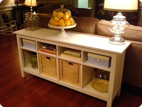
6. Anchor a couch that is out in the middle of the room with a console table, buffet, or dresser behind it. I do not like the look of a couch floating out in the middle of nowhere.
 (Photo Source: Thrifty Décor Chick)
7. Try to create balance in the room. You don’t want one side of the room to seem really full while the other seems empty. You don’t want to have all the massive pieces on one side and the delicate pieces on the other. Try to balance out the room so it seems equal on both sides.
8. For large rooms, create more than one sitting area. When sitting in a furniture configuration you should be able to speak to another person in the same configuration without raising your voice. If you can’t do that, you arrangement is too big. You could do a main sitting area, and then maybe a smaller one in another part of the room. Don’t be afraid to divide up large rooms for separate purposes.
![[July09.jpg]](https://blogger.googleusercontent.com/img/b/R29vZ2xl/AVvXsEj_j6MjXdLodpBLLEPPnP8eWTmX9T_aV5I_7UcssNufm4-_I1F_F-fSwCWr3HPa8K2woRgfVa_X5Firv-PrDu8Ed5uC0K_8FoBCcHWESqJ9jZKhXIJABKugrC8vaBqzEtp_9IVm9v43_7Q/s1600/July09.jpg)
(Photo Source: House Beautiful)
I hope these tips give you some ideas on how to arrange your rooms better. Hopefully no “real” designers will read this and laugh at me
Let me know if you have any questions about this!


![[family+room+interior+design.jpg]](https://blogger.googleusercontent.com/img/b/R29vZ2xl/AVvXsEgMfPlTCRxllM_D1zc3sA834KkA5i7rUwH3eginB5BAXMRtA2AkftZfJIAhLaa0FprO9cvS8QucyHLtZ7RNGSjZs-VsLhphAacZvZZy-g2cHPrA2N-2PflPhZGkba6DmOE6ed09JnT2VBF2/s1600/family+room+interior+design.jpg) (
( (
( (
(


WOW!! Classic design. Superb interior design. I like so much. Everything looks fantastic.
ReplyDelete-Girls bedroom furniture
Gosh, if you're looking for things to write about, do a series on things like this! It might be a no-brainer to you, but it isn't for everyone! Love it!
ReplyDeleteI agree with Natalia, I want more!!
ReplyDeleteThis is FABULOUS!!! We have a random couch in the middle of our living room at an angle and it just feels like such a loner! I'll have to try the table idea to anchor it. This is the answer I've been looking for! Yaaaaaaay! These are all such good ideas! Pulling furniture AWAY from the walls!?! I love it! You ROCK!
ReplyDeleteI enjoyed reading this.... and I would enjoy more. :) I feel like common sense tells me what you said but it's nice to hear it from a 'professional'. (Yes, I read that you're not licensed, but you're still a professional in your own right.) :) ~Rachel
ReplyDeleteI love that white loft!! If you've got any ideas how to paint a great room/kitchen (not the same color on every wall) then I'm all ears! The space is good, but figuring out how to decorate is hard.
ReplyDeleteHey, Emily! This was very interesting and loved your inspiration pics. I wish I had Candice's handyman for building units to help with space planning! LOL!
ReplyDeleteI wanted to tell you I can completely relate to being a Mom first, designer second! Your time will come...and probably too fast! Enjoy those precious boys, like you are, while they are little! That is the most important job you will EVER have! I know you know this, I just wanted to say I applaud you!
yes...yes...more more more!!! Loved EVERY picture/tip/arrangement...I've got FOUR sliding glass doors fighting for everyone's attention...it's time to get my creative juices flowing and do something to update my living spaces. I need posts like this...keep 'em comin!!!
ReplyDeleteGreat ideas and tips!
ReplyDeleteThanks for sharing :)
Loving the pictures you chose!
I enjoyed the read. Something I am trying to get better at :)
ReplyDeleteI love these ideas--thanks so much! I can't wait to read more. I would love to have you in my house rearranging my furniture!! ;)
ReplyDeleteWhat a lovely blog you have! Newest follower for sure. I'm a wannabe designer too. Lots of schooling and hard work involved. I'm too old to really get my degree, but like you said, there's a lot you can do even without the degree.
ReplyDeleteCindy
Great tips - found you through Today's Creative Blog linky party! Am now a new follower - would love if you'd stop by www.decoratingdiy.blogspot.com and follow me!
ReplyDeleteKristen
Turning a House into a Home
I loved this post too, Emily. Now I want one on how to use color in interior design. You are so good with color.
ReplyDeleteEmily, I don't have any background in design or interior decorating so I learned so much from this post. Bookmarking it :) Really appreciate you sharing this great post with us at the Creative Bloggers' Party & Hop.
ReplyDeleteI have no idea what took me so long to get over here to you.
ReplyDeleteOur story is EERILY similar!!! Love the design tip refresher!!! I'm off to stalk you some more! ;-D
robelyn
Emily, great job explaining what US professionals take for granted that everyone knows a) what a space plan IS. b) how to space plan. c) WHY to space plan!! So I'm the real deal interior designer turned SAHM, but you are too!! Don't sell yourself short! Enjoyed nodding my head to your points above. Found you on Tip Junkie and will be back!
ReplyDeletehttp://megschmitt-neveradullday.blogspot.com/
Nice Blog! Thanks for sharing the post! interior design courses
ReplyDeleteI loved this post too, Emily. Now I want one on how to use color in interior design. You are so good with color.
ReplyDeletelos angeles interior designer